Invoices
Dashboard components
Invoice summary
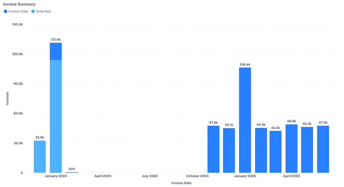
This chart displays an Invoice Summary, which provides a visual overview of your invoicing and payment trends over time.
Understanding the invoice summary chart
The chart is a bar graph that visualizes two key metrics: Invoice Total and Total Paid, against the Invoice Date.
- X-axis (Invoice Date): This represents the timeline, showing months where invoices were generated (e.g., January 2024, October 2024, January 2025). Notice that there are gaps in the timeline (e.g., between January 2024 and October 2024), indicating months where no invoices were issued or are not displayed in this view.
- Y-axis (Invoices): This represents the monetary value of invoices, ranging from 0 to 150.0k.
- Invoice Total (Blue bars): These bars represent the total value of all invoices issued in a given month. For instance, in January 2024, the invoice total was 131.4k, and in January 2025, it was 106.4k.
- Total Paid (Light blue bars within Invoice Total): These bars, overlaid on the Invoice Total bars, represent the amount of money that has been paid for invoices issued in that specific month. The difference between the top of the blue bar and the top of the light blue bar indicates the outstanding amount for that month's invoices. For example, in January 2024, a significant portion of the 131.4k invoice total was paid, but some remained unpaid. Conversely, in October 2024, the entire 47.6k invoice total appears to have been paid.
How this chart aids invoice analytics
This "Invoice Summary" chart is a powerful tool for understanding your billing and collection performance:
- Revenue trends: You can quickly identify months with high or low invoice volumes, giving you insight into your billing cycles and sales performance.
- Payment performance: By comparing the "Invoice Total" to the "Total Paid" for each month, you can visually assess how quickly and completely invoices are being settled. Months where the light blue bar is significantly shorter than the blue bar indicate a larger outstanding balance.
- Cash flow insights: This summary helps in understanding past cash inflows and anticipating future ones based on payment trends.
- Anomaly detection: Sudden spikes or drops in either invoice totals or paid amounts can signal anomalies that warrant further investigation.
- Forecasting: Historical patterns in invoicing and payments can aid in more accurate financial forecasting.
Outstanding balances by due date
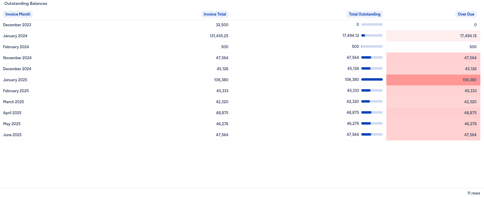
This chart displays an Outstanding Balances report, which is a crucial component of invoices analytics. It provides a detailed breakdown of your company's financial receivables, allowing you to track the status of invoices and identify overdue payments.
Understanding the outstanding balances report
The report is structured as a table, presenting key financial metrics per invoice month.
- Invoice month: This column indicates the month in which the invoice was generated. For example, you can see data spanning from December 2023 to June 2025.
- Invoice total: This represents the total value of all invoices issued within that specific month.
- Total outstanding: This shows the total amount of money that customers still owe for invoices issued in that month. The blue bar next to the number visually represents its proportion relative to other outstanding amounts.
- Over due: This critical column highlights the portion of the
Total Outstandingamount that has passed its due date. The red shading indicates that these amounts are overdue, signaling potential issues with collections.
How this report aids invoices analytics
This "Outstanding Balances" report is vital for several aspects of invoices analytics:
- Cash flow monitoring: By quickly seeing
Total OutstandingandOver Dueamounts per month, you can assess immediate and future cash flow. - Collections prioritization: The
Over Duecolumn, especially with its visual highlighting, helps finance teams identify which months and, by extension, which invoices require immediate attention for collection efforts. - Trend analysis: Observing the
Invoice Total,Total Outstanding, andOver Dueamounts over several months allows you to identify trends in billing, payment behavior, and collection efficiency. For instance, a consistently highOver Dueamount for recent months might indicate a systemic issue. - Financial health assessment: A clear view of outstanding and overdue balances is fundamental to understanding the overall financial health of your business.
Invoice summary by customers
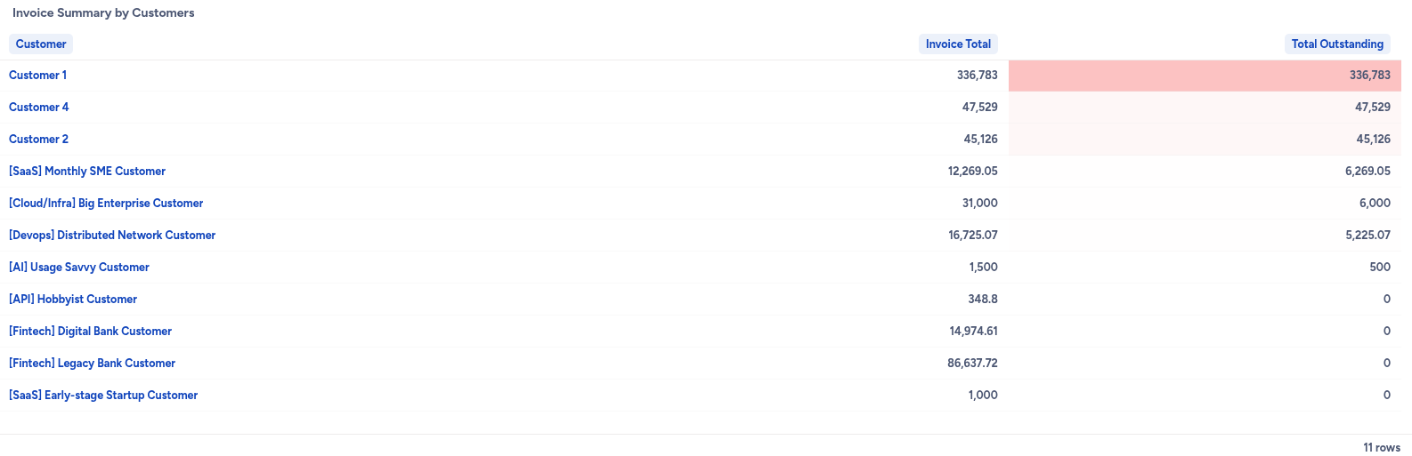
This chart displays an Invoice Summary by Customers report, which provides a detailed breakdown of invoice totals and outstanding amounts for each customer.
Understanding the invoice summary by customers report
The report is presented as a table, summarizing financial data per customer.
- Customer: This column lists individual customers or customer segments (e.g.,
Customer 1,[SaaS] Monthly SME Customer). - Invoice total: This represents the total value of all invoices issued to that specific customer.
- Total outstanding: This shows the amount of money that each customer still owes. The red shading, as seen for
Customer 1, indicates that the entire outstanding amount is likely overdue.
How this report aids invoices analytics
This "Invoice Summary by Customers" report is highly valuable for various aspects of invoices analytics:
- Customer-level receivables: It provides an immediate view of which customers have outstanding balances and how much they owe.
- Collections focus: The report helps prioritize collection efforts by clearly showing customers with high outstanding amounts, especially those highlighted in red as overdue.
- Customer financial health: By reviewing individual customer rows, you can gauge the payment behavior and financial health of your client base.
- Dispute identification: Large outstanding amounts for specific customers might indicate ongoing disputes or issues that need to be resolved.
Debtors (top outstanding customers)
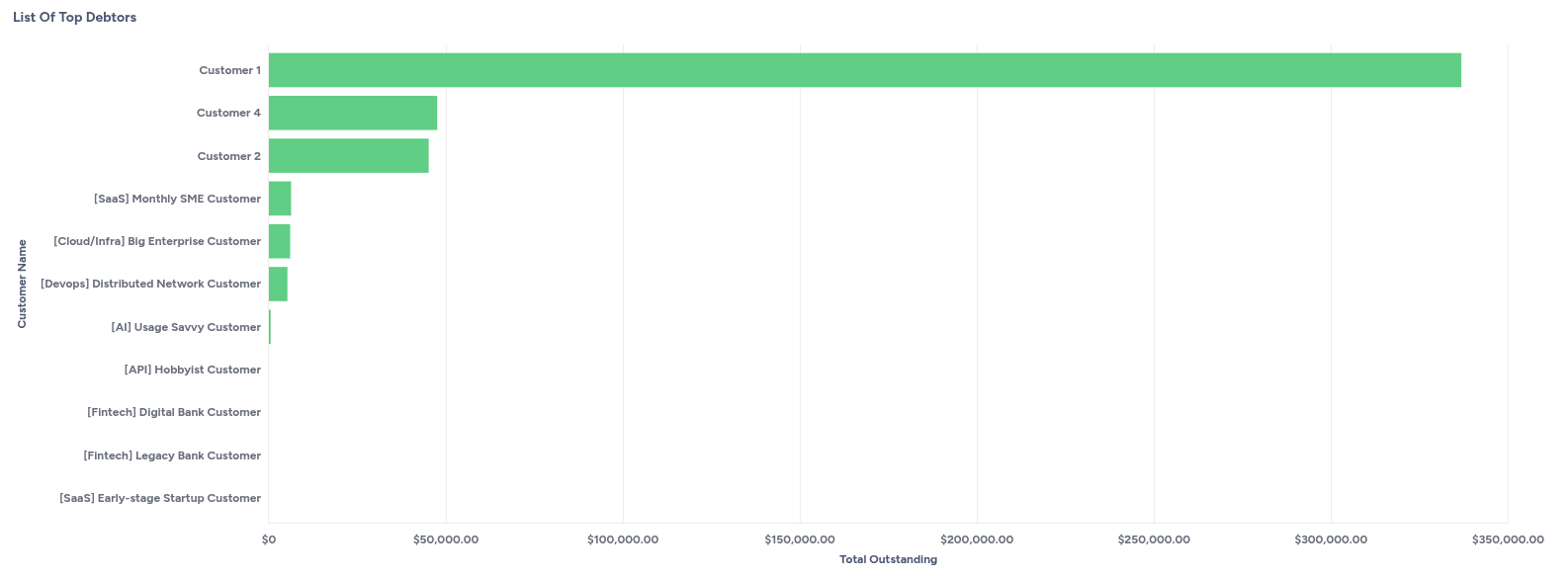
This chart displays a List of Top Debtors, which is a horizontal bar graph visualizing the total outstanding amounts owed by individual customers.
Understanding the list of top debtors chart
The chart is a horizontal bar graph that provides a quick visual summary of your largest outstanding receivables by customer.
- Y-axis (Customer Name): This lists individual customers or customer segments (e.g.,
Customer 1,Customer 4,[SaaS] Monthly SME Customer). The customers are typically ordered from the highest outstanding balance to the lowest. - X-axis (Total Outstanding): This represents the monetary value of the outstanding amount, ranging from $0 to $350,000. The length of each bar corresponds to the total outstanding balance for that customer.
- Green bars: Each green bar visually represents the
Total Outstandingamount for the corresponding customer listed on the Y-axis. Longer bars indicate larger outstanding balances.
How this chart aids invoices analytics
This "List of Top Debtors" chart is an invaluable tool for managing accounts receivable and improving collection strategies:
- Prioritization of collections: It immediately highlights the customers who owe the most money, allowing collection teams to prioritize their efforts on the largest debts. For instance,
Customer 1clearly has the highest outstanding balance. - Financial risk assessment: By identifying top debtors, businesses can assess their exposure to credit risk and take proactive measures if certain customers consistently have large outstanding amounts.
- Customer relationship management: It can inform discussions with customers about their payment status, especially for those with significant outstanding balances.
- Cash flow impact: Understanding who owes the most helps in forecasting potential cash inflows once these debts are collected.
- Performance monitoring: Over time, this chart can be used to monitor whether efforts to reduce outstanding balances from top debtors are effective.
Aging report
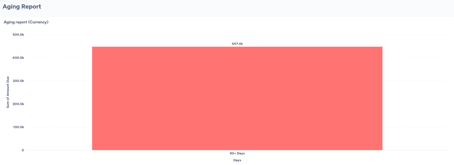
This chart displays an Aging report (Currency), which is a bar chart visualizing the sum of outstanding amounts categorized by the number of days they are past due.
Understanding the aging report (currency)
The chart is a bar graph that provides a clear visual representation of your outstanding receivables, specifically focusing on how old those debts are.
- X-axis (Days): This represents the aging buckets for outstanding amounts. In the provided image, only one bucket is shown:
90+ Days. This means the chart is currently filtered or configured to display only amounts that are 90 days or more past due. - Y-axis (Sum of Amount Due): This represents the monetary value of the outstanding amounts, ranging from $0 to $500,000.
- Coral bar: The single coral-colored bar visually represents the
Sum of Amount Duefor all invoices that fall into the90+ Dayscategory. The value447.4kindicates a significant amount of money is outstanding for a long period.
How this report aids invoices analytics
This "Aging report (Currency)" is a critical tool for managing accounts receivable and understanding the health of your collections:
- Identifies long-overdue debts: The report immediately highlights the oldest and potentially most difficult-to-collect outstanding amounts. In this specific view, it shows that a substantial sum is over 90 days past due.
- Prioritizes collection efforts: By knowing which invoices are in the oldest aging buckets, businesses can prioritize collection efforts on these high-risk amounts.
- Assesses collection efficiency: Over time, tracking the amounts in different aging buckets (e.g., 0-30 days, 31-60 days, 61-90 days, 90+ days) helps in evaluating the effectiveness of collection strategies. A growing
90+ Daysbucket suggests inefficiencies. - Informs financial provisioning: High amounts in older aging categories can impact financial statements, as these amounts may need to be provisioned for as bad debt.
- Cash flow forecasting: Understanding the age of receivables helps in making more realistic cash flow forecasts, as older debts are less likely to be collected quickly.
Invoice count and status over time
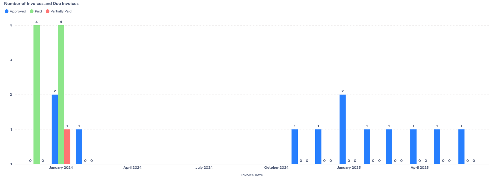
This chart displays Number of Invoices and Due Invoices, which provides a visual representation of invoice statuses over time.
Understanding the number of invoices and due invoices chart
The chart is a bar graph that tracks the count of invoices based on their status: Approved, Paid, and Partially Paid, against the Invoice Date.
- X-axis (Invoice Date): This represents the timeline, showing months when invoices were generated (e.g., January 2024, October 2024, January 2025). Gaps in the timeline indicate months with no invoices or those not displayed in this view.
- Y-axis (Number of Invoices): This axis represents the count of invoices, ranging from 0 to 4.
- Approved (Blue bars): These bars indicate the number of invoices that have been approved in a given month. For example, in January 2024, 2 invoices were approved, and in January 2025, 2 invoices were also approved.
- Paid (Green bars): These bars show the number of invoices that have been fully paid. In January 2024, 4 invoices were paid.
- Partially Paid (Red bars): These bars represent the number of invoices that have received a partial payment. In January 2024, 1 invoice was partially paid.
How this chart aids invoice analytics
This "Number of Invoices and Due Invoices" chart is a valuable tool for monitoring your invoicing and collection processes:
- Invoice volume and status at a glance: You can quickly see the number of invoices issued and their payment status for each month.
- Collection efficiency: By comparing the number of approved invoices to those paid or partially paid, you can assess the efficiency of your collection efforts. A high number of approved invoices with a low number of paid invoices might indicate collection challenges.
- Identification of bottlenecks: A rise in "Partially Paid" invoices could signal issues with customer payment plans or disputes.
- Cash flow forecasting: Understanding the volume of approved versus paid invoices helps in forecasting anticipated cash inflows.
- Trend analysis: Observing the patterns over several months can reveal trends in invoice approval, payment cycles, and potential periods of increased overdue invoices.
Days sales outstanding (DSO)
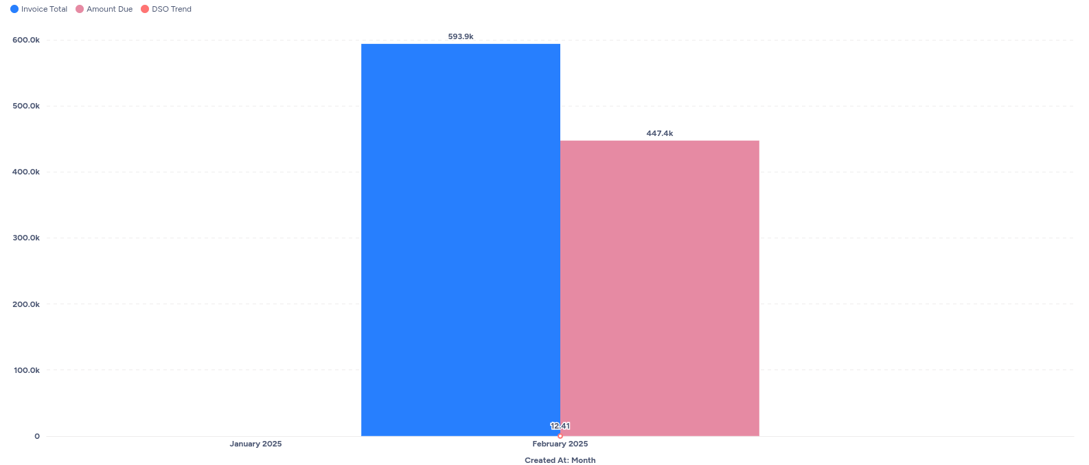
This page displays a DSO - WIP (Day Sales Outstanding - Work In Progress) chart, which visualizes key financial metrics related to invoicing and collections over time.
Understanding the DSO - WIP chart
The chart is a bar graph that presents three important metrics: Invoice Total, Amount Due, and DSO Trend, categorized by the month of creation.
- X-axis (Created At: Month): This represents the timeline, showing the months in which invoices were created (e.g., January 2025, February 2025).
- Y-axis: This axis represents monetary values, ranging from 0 to 600.0k.
- Invoice Total (Blue bars): These bars represent the total value of invoices created in a given month. For example, in February 2025, the
Invoice Totalwas 593.9k. - Amount Due (Pink bars): These bars represent the total amount of money that is still outstanding for invoices created in that month. In February 2025, the
Amount Duewas 447.4k. - DSO Trend (Red dot/line): This represents the Day Sales Outstanding, which is a key metric indicating the average number of days it takes for a company to collect revenue after a sale has been made. In February 2025, the
DSO Trendwas 12.41 days.
How this chart aids invoice analytics
This "DSO - WIP" chart is a powerful tool for monitoring and improving your company's collection efficiency and cash flow:
- Collection performance at a glance: You can quickly see the relationship between the total invoiced amount and the amount still due, providing an immediate sense of how much is being collected.
- DSO tracking: The
DSO Trendis crucial for understanding how efficiently your company is collecting its receivables. A lower DSO generally indicates better cash flow management. Tracking this trend over time allows you to identify improvements or deteriorations in collection speed. - Identifying bottlenecks: If the
Amount Dueis consistently high relative to theInvoice Total, or if theDSO Trendis increasing, it could signal issues in your billing, payment, or collection processes that require investigation. - Cash flow forecasting: By observing the trends in
Invoice Total,Amount Due, andDSO, finance teams can make more informed predictions about future cash inflows. - Strategic decision-making: Insights from this report can inform decisions related to credit policies, customer payment terms, and collection strategies to optimize working capital.
Key terms in the dashboard
| Term | Definition |
|---|---|
| Invoice total | The total amount billed to a customer. |
| Payments received | The amount collected against issued invoices. |
| Outstanding | The unpaid balance across all open invoices. |
| Overdue | The portion of the outstanding balance that has passed its due date. |
| DSO | Days sales outstanding — average time taken to collect receivables. |
| Partially paid | An invoice that has been paid partially and still has a balance due. |
| Aging buckets | Categories (e.g., 30/60/90 days) showing how overdue each invoice is. |
| Customer type | A classification in Zenskar (e.g., SaaS, infra) used for analytics. |
Additional notes
- All charts and metrics update in near real-time based on invoice and payment data synced into Zenskar.
- The dashboard supports filters for customer, time period, and customer type.
- Exports are available in CSV format for offline reporting.
Updated 5 months ago